This is a commercial for my Infinity Phone, Kyle's Football Gloves, and Grayson's Football glove machine. This assignment was to get used to using the video software Premiere Pro.
|
This logo is for my phone the infinity. This logo spells out infinity and also has an infinty sign overlapping the letter. This logo represents my project because it looks a little futuristic and my phone is called the infinity because it's the last phone you'll ever need.
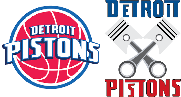 For this project I rebooted the pistons logo. The original logo is on the left and the one I created is on the right. The orgin of the pistons is the first owner of the pistons had a company that manufactured pistons. They were orginally in Indiana but revenue was small so they moved to Detroit. The name "Pistons" still fit because Detroit is known for it's automotive industry.
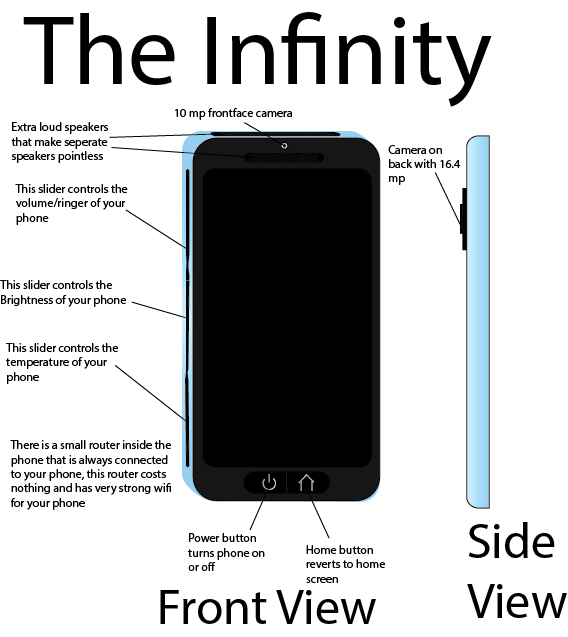 The infinity is a phone. It is separated from it's competitors because it has a couple key features. This phone has the ability to get hot or cold, has a user friendly design, highest quality of cameras found in phones, and lastly this phone has built in wifi.
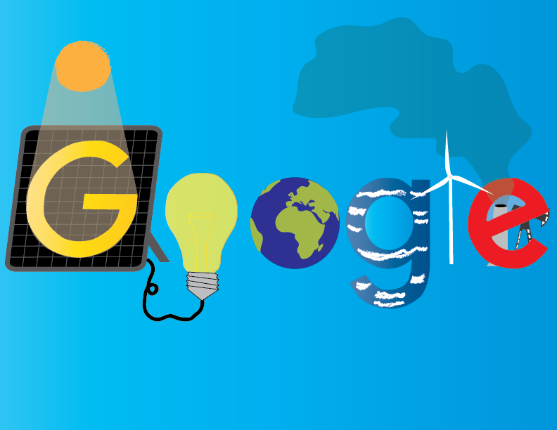 This year I did another doodle for google. The contest theme was what will the world look like in the future. In the future I would hope we use a lot more cleaner and renewable energy. Examples of these energy sources are solar power, wind energy, and hydro power which are all shown in my design.
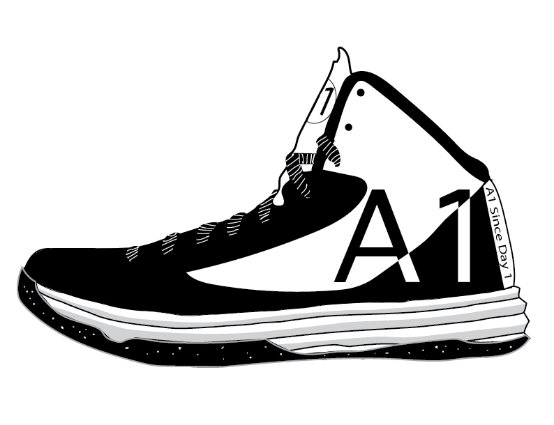 For this design the goal was to make a shoe that represents my brand. Brand is basically your personality or traits that make you who you are. For my brand I thought about what I wanted people to view me as. Some traits I came up with were athletic, smart, competitive, organized, hardworking, and simple. For example to represent athleticism It's a basketball shoe, to show intelligence and competitiveness I have and A1 standing for always striving to be the best. Also the A is there as a grade because I usually get A's. The shoe is organized to show I'm organized and the shoe is black and white to show simplicity.
For this project the requirements were simple just make a five second animation. I chose a basketball theme because it's my favorite sport. For my animation I had the person on offense dribble through his legs while the defender reaches for the ball and falls over. The offender then jumps from an unrealistic distance to dunk it and stick his forearm inside the rim. One problem I had during this was the rim filled in and I couldn't do anything to prevent it. I tried to make the ground crack when the player jumps to dunk it to add more detail but it wouldn't work. There were some other this like that I wish I could to to add more detail.
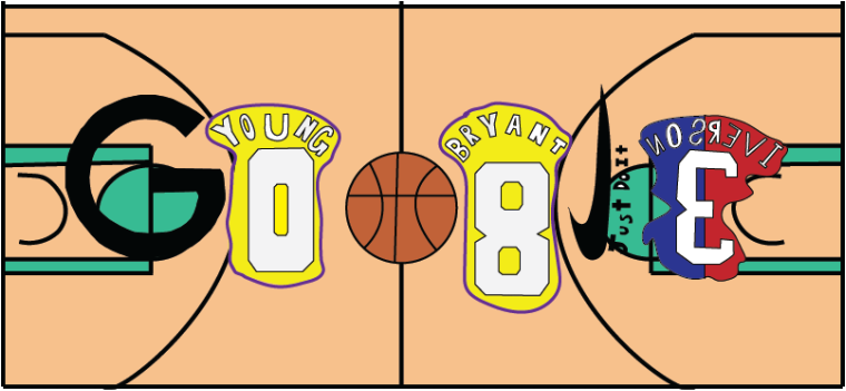 The design above is based off a contest for google. The theme for the contest was something about yourself or something that describes you. My first thought was basketball and I stuck with it. The tool I used the most was the pen tool. The pen tool was the best choice because its good for tracing around straight lines which I did a lot of. If I had more time during the project I would of added detail to the court with separate panels and a mix of colors. The most difficult obstacle I came to in the project was actually the research part. I knew I wanted to do basketball but I didn't know what specifically I wanted in my project. The thing I like most about this project is you could do whatever you wanted.
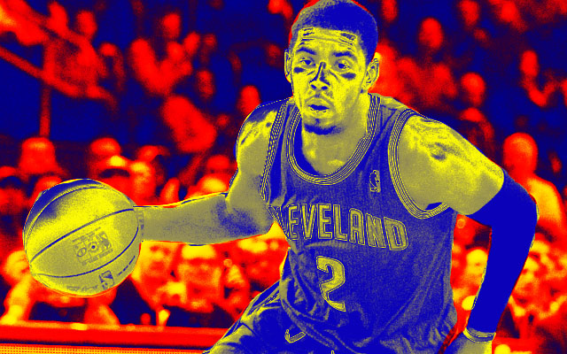
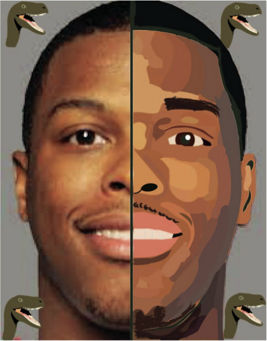 This project is taking half of a face and remaking it in Adobe Illustrator. Something challenging about this project doing the facial hair because it was hard to see. If I did this project again I would use a picture that looked less blurry when I zoomed in so I could be more precise. One tool I used a lot in this project was the pencil tool. The pencil tool was especially helpful when doing the lighting on his face. You could outline the area with the pencil then fill it in with the right color. I chose to do Kyle Lowry because he's one of my favorite players in the NBA. The dinosaurs are in each corner because Kyle is on the Toronto Raptors and the raptors signify his team.
In this design I used the colors because they were bright and stuck out. I used the blob brush to use the space inside the stroke and make it easier to read. 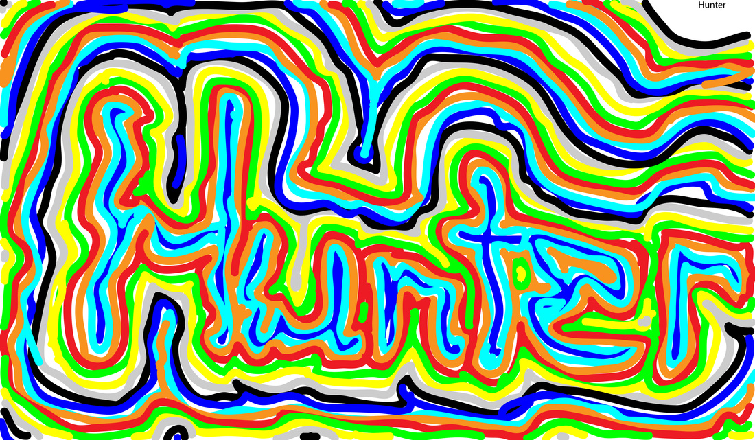 |
Ball is Life 
January 2017
Categories |
 RSS Feed
